Summary:
- User experience (UX) refers to the overall experience visitors have when interacting with your website. UX includes every aspect of the interaction, including usability, functionality, and design.
- UX is especially important for solar companies because potential customers often perceive solar tech as complicated or confusing. The simpler and more accessible you can make your solar company’s website, the easier it will be to generate leads, qualify them, and turn them into buyers.
- While UX is important throughout a website, solar companies should pay special attention to their service pages—since these are the pages that explain and promote what they’re selling. Your service pages are vital for converting qualified leads to customers.
- Best practices for improving UX on solar company service pages include simple, easy-to-navigate designs, small blocks of efficient copy that are easy to read, and adding customer reviews or testimonials. It’s also critical to optimize your site and service pages for mobile devices, and make improvements based on analytics and user feedback.
- Common mistakes to avoid when building service pages for solar installers include using too much technical jargon, over-optimizing for SEO, and not focusing on user intent.
Your website will be the first impression your company makes on most customers, so you need to make sure it serves them. Focusing on your site’s user experience (UX) ensures that each visitor can get the information they need with minimal friction, which makes it easier for you to guide them towards a decision.
Strong UX is a critical part of every successful website, but it’s extra important for solar companies—since many of the pain points solar installers face are related to common perceptions of solar technology being complicated or hard to understand. Building your website and service pages to offer an easy, straightforward user experience helps counter this perception, removing one of the biggest obstacles between you and your customers. Here’s what we recommend (and what we don’t) to help you get started.
What Is UX & What Does It Include?
UX comprises every aspect of a given visitor’s interaction with your site—but broadly speaking, you can break most UX tasks into three different silos:
- Usability: how easy the site is to use—this includes things like load times, mobile compatibility, accessibility features, etc.
- Functionality: this refers to the operations visitors can perform while visiting your site. For example, is your site basically just a digital business card with your logo and contact information, or does it include ecommerce features and detailed product and service pages?
- Design: the style, appearance, and layout of the site. This includes things like colours, logo design and placement, font size, where the text blocks and accordion menus are located, and the like.
All three of these categories are important parts of creating a strong user experience. Your solar company’s website should be friendly and attractive enough to engage visitors (design), fast and easy enough for anyone to navigate (usability), and provide them with the tools they need to learn more about your products, contact you, and become customers (functionality).
Where to Focus Your UX Efforts As a Solar Company
In a perfect world, every aspect of your website would offer an ideal user experience—and when you hire digital marketing professionals to build your website, we have the skills and tools to create strong UX across the board. But if you want to improve your UX on your own and you have to pick a single area to focus on first, we recommend starting with your service pages.

Your service pages are the next stop for your leads once they’ve been qualified. Via Adobe Stock.
Service Pages Are the Key to Conversions
Service pages are where your potential customers will most likely go after they’ve already been educated to some extent about what you offer. Maybe they read your blog about the benefits of solar panels for homeowners, saw the landing page you made that breaks down exactly how much solar panels could save them on electricity each year, or found the pinterest infographic you made with stats on how solar panels work—these should all be parts of your content strategy, which helps qualify leads after you’ve generated them.
Qualified leads already have an interest in your services and want to know more about the next steps to take—so their next stop will be your service pages. At this stage, they’ll be looking for information that tells them what to expect if they purchase from you—so the better your UX is on service pages, the more likely you are to convert qualified leads into sales.
Learn About our $3K Website, PPC and SEO Bundle for Solar Businesses
Best Practices for UX on Solar Websites
Here’s a list of things you can to to boost your site’s UX right now:
For Functionality
- Include ecommerce features. Sites that let visitors purchase your services online remove steps for potential customers and improve conversion rates. Adding ecommerce plugins to WordPress is relatively easy and can easily offset the costs.
- Create high-quality content. Build out your service pages to include FAQ sections, interactive features (like cost calculators), and other content that offers valuable solutions to the problems your customers are there to solve.
- Include customer testimonials. Put a “Testimonials” or “Reviews” section on your homepage so visitors can find out what other people have to say about your business easily. This gives you credibility, and it’s a feature people will look for—72% of site visitors will only take action after reading a positive review.
For Usability
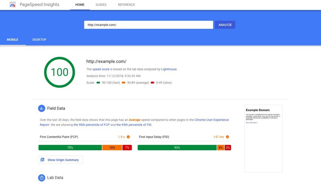
- Optimize page load times. Some ways to do this include lazy-loading images (so the ones near the bottom of the screen load last instead of loading all at once), and removing unused javascript or CSS code. You can test page speed—and other core web vitals—with PageSpeed Insights and similar tools.

You can use PageSpeed Insights to see the speed score and more for each of your site’s pages. Via Google Developers.
- Design for mobile. 60% of all web traffic now comes from mobile devices—so if these users are struggling to use your page, you’re missing out on a massive market.
- Use A/B testing. This method weighs two different elements of your site against each other to determine which one is performing better. It’s a great way to find out which blogs and service pages are your heavy hitters so you can improve the rest to be more like them.
For Design
- Use a clear and consistent layout throughout the site. We recommend using templates for pages of the same kind (service pages, contact pages for different service areas, etc.). Plugins like Divi can make this easier—learn more about designing site layouts in Divi here.
- Embrace minimalism. Use white space, avoid cluttered layouts, and keep your text blocks short and sweet.
- Create clear calls to action. CTAs guide your site’s visitors towards taking action—they should be clearly and prominently displayed in your homepage, landing pages, contact page, and blogs. Keep them short, friendly, and authoritative (“Learn more about going solar—contact us now and speak with an expert”).
Common UX Mistakes for Solar Installers to Avoid
While you’re working to improve your site’s UX, make sure to avoid these common pitfalls:
- Using too much technical jargon. Your site doesn’t have the room and your visitors don’t have the patience. Keep your content tight and lean so people can find what they’re looking for and take action easily.
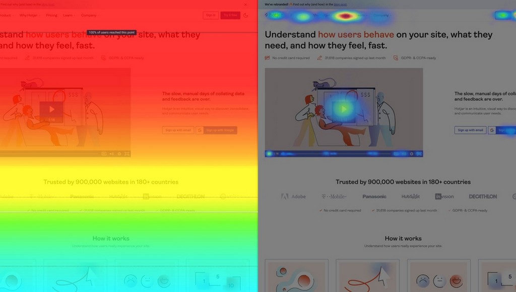
- Ignoring analytics and user feedback. You need to know where your site’s visitors are spending most of their time so you can determine what parts of the site are performing best and which ones need attention. Use tools like Hotjar to get insights on user behavior and Google Analytics to track sessions and bounce rates.

A scrollmap (left) and heatmap (right) created with Hotjar—these are important tools for visualizing user behaviour on different parts of your site. Via Hotjar.
- Over-optimizing for SEO. SEO is important, but it should never come at the expense of UX. Don’t stuff keywords into every heading and avoid excessive linking. Learn more about what over-optimized content looks like and how to avoid it here.
- Not considering user intent. The key to creating awesome UX is thinking like your users—so you need to make sure your site’s design and content are solving their pain points (not knowing enough about solar’s benefits, not having a clear idea of the costs involved, etc.). Bundling your site design with digital marketing services can ensure that all your digital assets are aligned and working together to support your goals
Keeping Your Site’s UX Strong In a Competitive Landscape
The basics of UX are easy to understand, and they can take you a long way. Using the recommendations above to improve your site’s usability, functionality, and design will simplify and enhance the way visitors interact with your site, making it easier for them to learn about solar’s benefits and guiding them towards becoming customers.
For more in-depth insights about your site’s UX and how to optimize it, reach out to our team at Monochrome Marketing. Solar is a key area of focus for our team of expert digital marketers, and we’ll be happy to work with you to make sure your site offers the best possible experience for your potential customers.
